RONDO. The exhibition of graphics by Mariya Plyatsko and Oleksandra Sysa
12.3.2020
Rondo Café, Str. Bohomoltsia, 6
The exhibition of graphics by Mariya Plyatsko and Oleksandra Sysa in the relaunched Rondo Café.
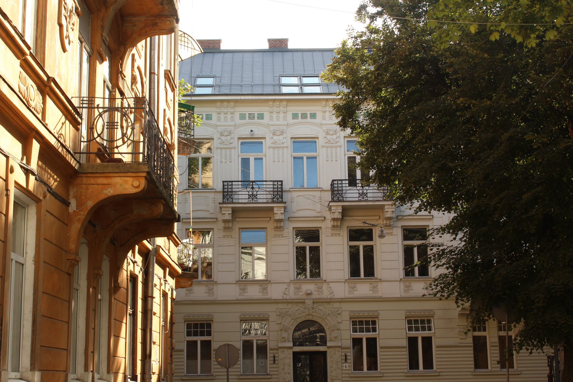
"a brand new street… was diversified with a small but a very harmonious garden square, a 'rondo,' as they say in Lviv… a green lawn instead of pavement adds to the buildings around and to the street itself a certain relief and appeasement, it breaks the monotony of a straight line." This quote comes from a 1908 article titled "The Newest Lviv," written by Franciszek Mączyński for the Krakow magazine Architekt, where he analyzed recent architecture and urban planning happening in Lviv. He praised highly the new design of Adama Asnyka, which is now Bohomoltsia street.
However, Rondo was not invented in Lviv; in fact, the word comes from French, where it means "round." Over time, the word entered neighboring languages like Italian and eventually Polish, where the term is still used today meaning a "roundabout."
The Rondo at Bohomoltsia Street has been compared to palatial courtyards, or cour-d’honneurs, connoting the beauty of the surrounding, Secessionist-style architecture. However, the rondo was initially a daring experiment rather than a feature of simple delight. The Building Code of 1885, for instance, prohibited any deviations from established patterns and only allowed straight streets with no gardens. The architect Ivan Levynskyi, together with lawyers and the landlady, had to persistently defend their design to the city council. In their opinion, the design was actually better in "sanitary, aesthetic, and practical" terms. They explained that the design allowed more apartments to receive direct sunlight and that the street's oblique orientation would create more beautiful vistas. Levynskyi's team eventually won out, leading to the street's construction from 1904 to 1908.
The project serves as testimony to its creators' belief in the healing properties of beauty and the ability of architecture to communicate it. The design aimed to instill feelings of living-room comfort in urban spaces by arranging cozy squares and public gardens. This reflected a growing understanding of the importance of integrating internal and external planning in architectural design in order to maximize the comfort of inhabitants. The approach was regarded as a way to remedy feelings of emptiness and agoraphobia caused by the fuss and noise of contemporary cities. Rondo was designed precisely for this purpose, enticing residents to spend time outside, where they could contemplate the facades wreathed by stone and metal plants and feel the integrity of nature and architecture.
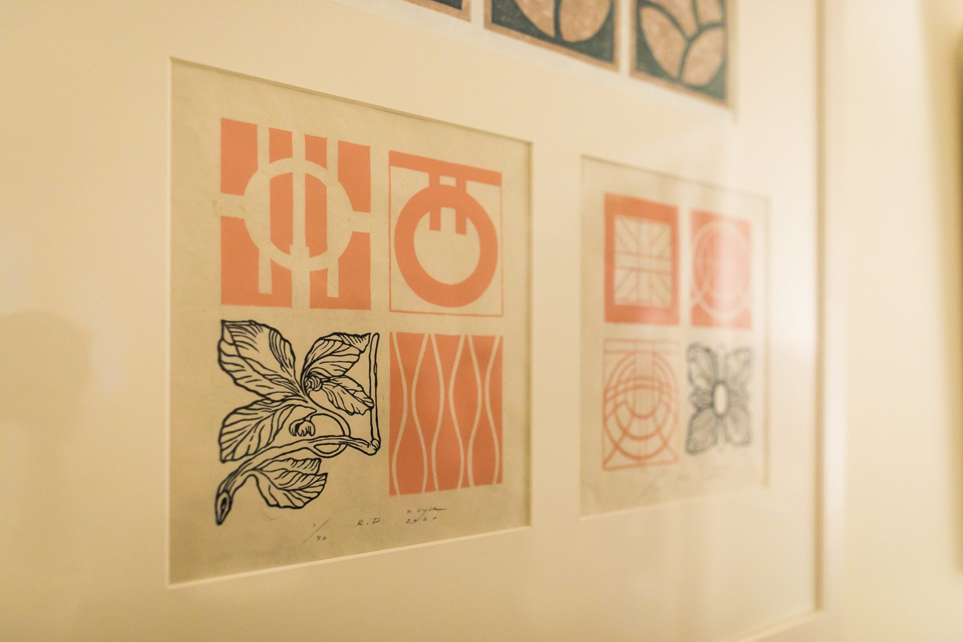
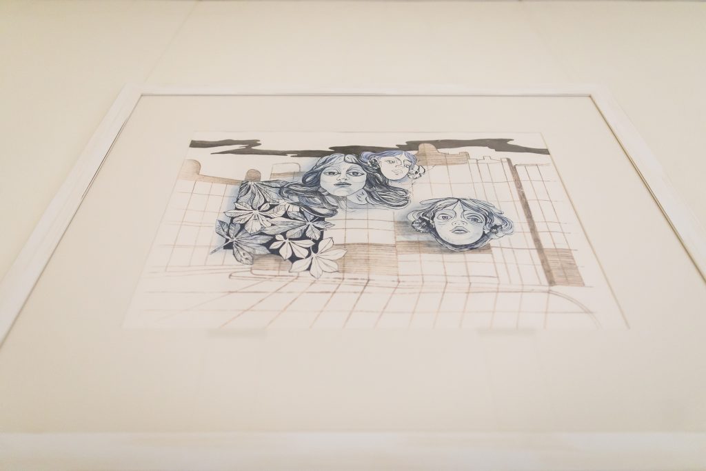
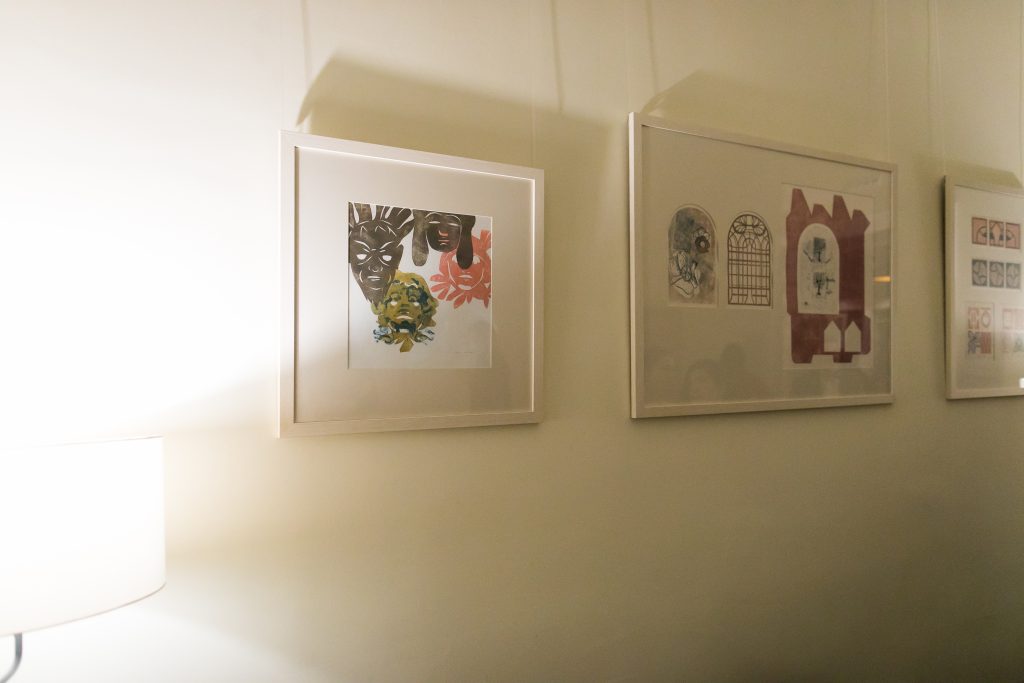
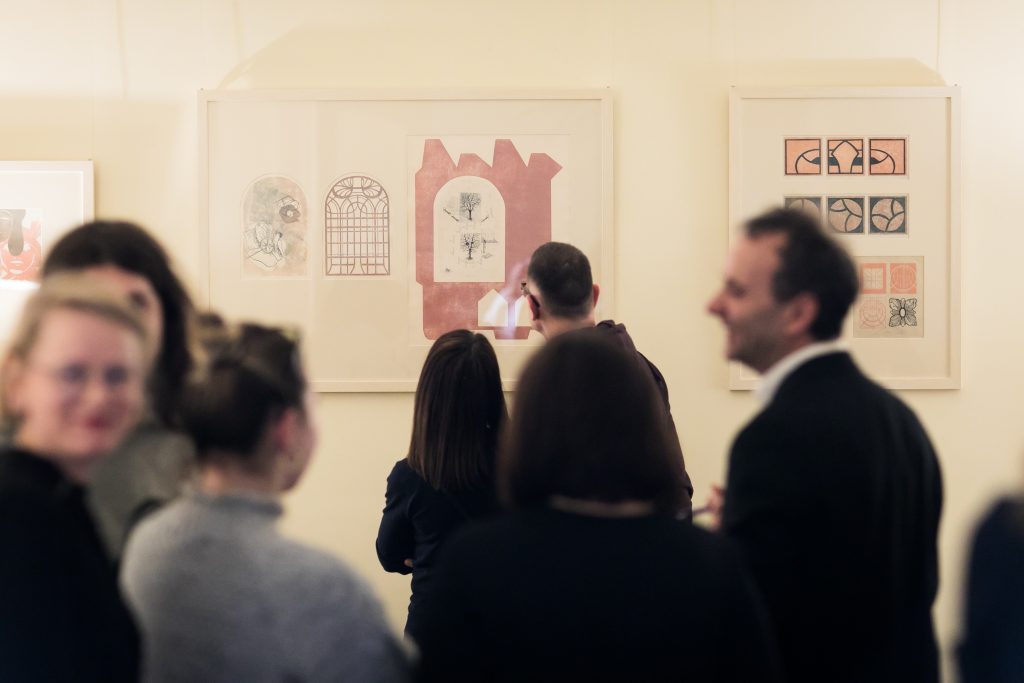
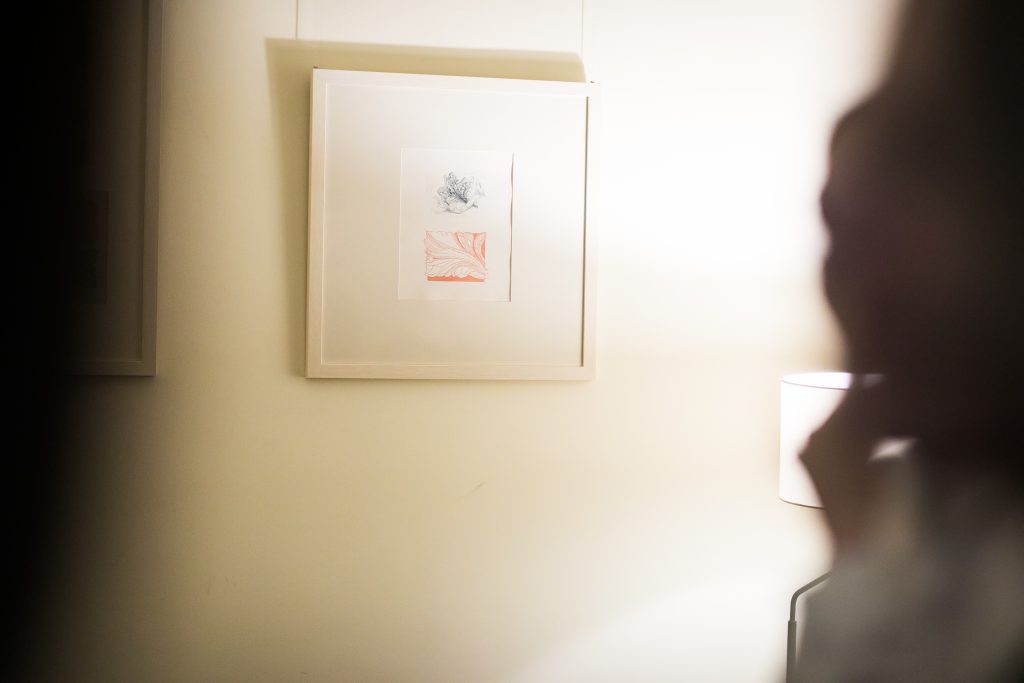
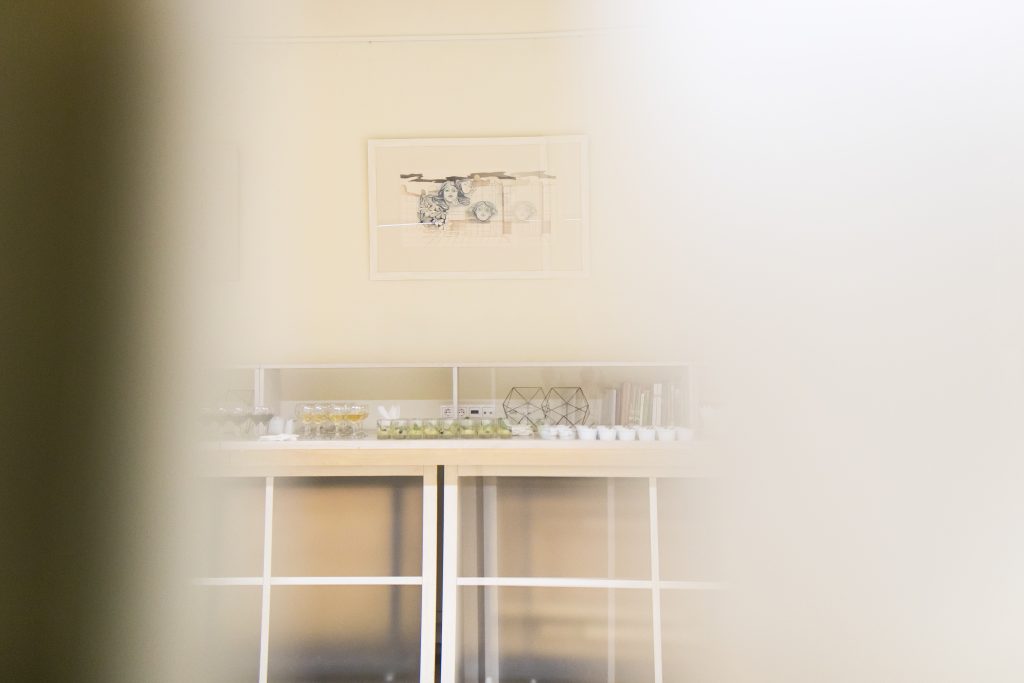
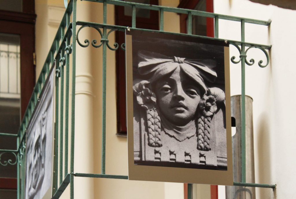
Blurring the boundaries of nature and architecture in the midst of the urban landscape is the leitmotif of this exhibition. Through the prism that artists Mariya Plyatsko and Oleksandra Sysa have created, we can discover details and subjects from the facades around the rondo that may have gone unnoticed before. Meandering vegetation in stone and metal, mascarons, majolika, the rondo from a human and aerial perspective, are all visualized in these graphics, and speak within the aesthetics of Secession magazines.
The exhibition was prepared by:
- Mariya Plyatsko and Oleksandra Sysa, artists
- Viktoriia Panas, curator, exhibition coordinator
- Olha Zarechnyuk, academic supervision, author of text
- Oleksandr Makhanets, Sofia Dyak, Harald Binder, Ryan Wolfe, consulting
Credits
Cover Image: Artwork by Mariya Plyatsko and Oleksandra Sysa
Gallery: Iryna Sereda
